The Visual Design of Into The Fray
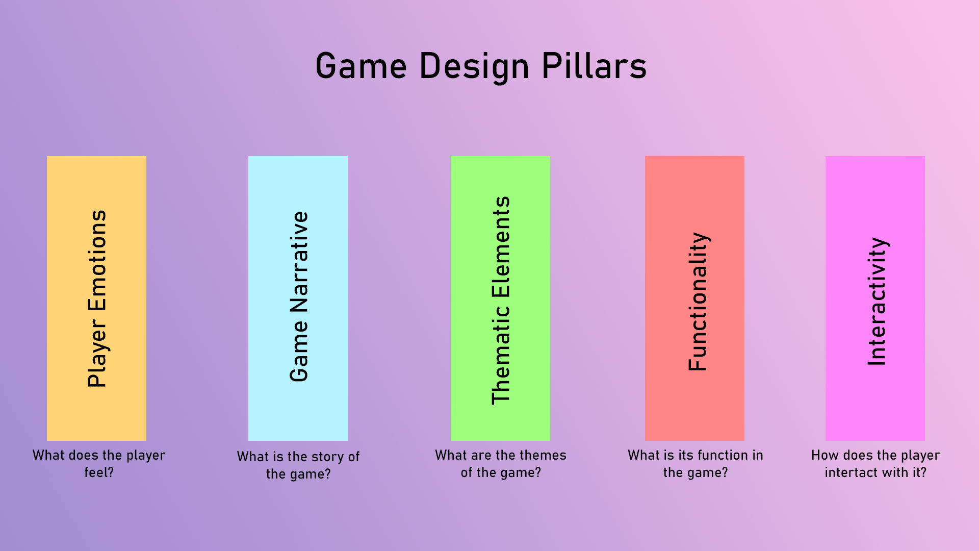
The Design Pillars:
The purpose of creating these pillars provide a framework for the game development process, ensuring that the game is consistent, immersive, and engaging for the player.
The game design process is guided by five pillars. The first pillar is player emotions, which involves designing the game to elicit specific emotions from the player. The second pillar is the game narrative, which requires that everything the player sees and interacts with in the game must make sense within the context of the game’s universe.
The third pillar is thematic elements, which deals with the theme and tonal continuity of the game. All the different design aspects must follow the themes to make sure that the player feels like they are in a futuristic post-apocalyptic world. The fourth pillar is functionality, which requires that all elements designed for the game must serve some kind of function.
The last pillar is interactivity, which requires that each element that is designed with interactivity in mind must be created in a way that facilitates smooth, consistent and engaging interactions with the player.
Level Design:
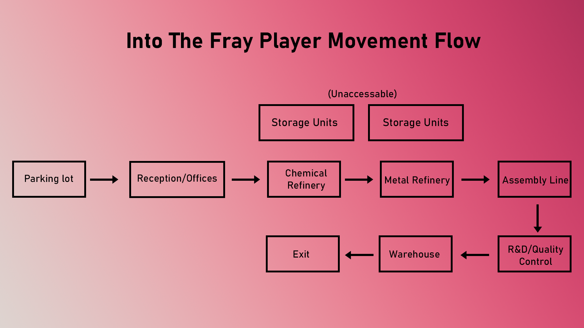
When creating the world for the game, my team and I decided to set the game in a building called the Pulse Tech Factory, which is a weapon’s manufacturing factory. The main influences for the design of the factory came from brutalist architecture from games like Control, and architecture in Europeane countries in the 1970s.
The game is set in the fictional island nation of Valenthia in the year 2080. The country is affected by a zombie epicdemic, and everything is in ruins now. I was responsible for creating the first level, which is the parking lot of the factory, and for the lighting and texturing in all the other levels.
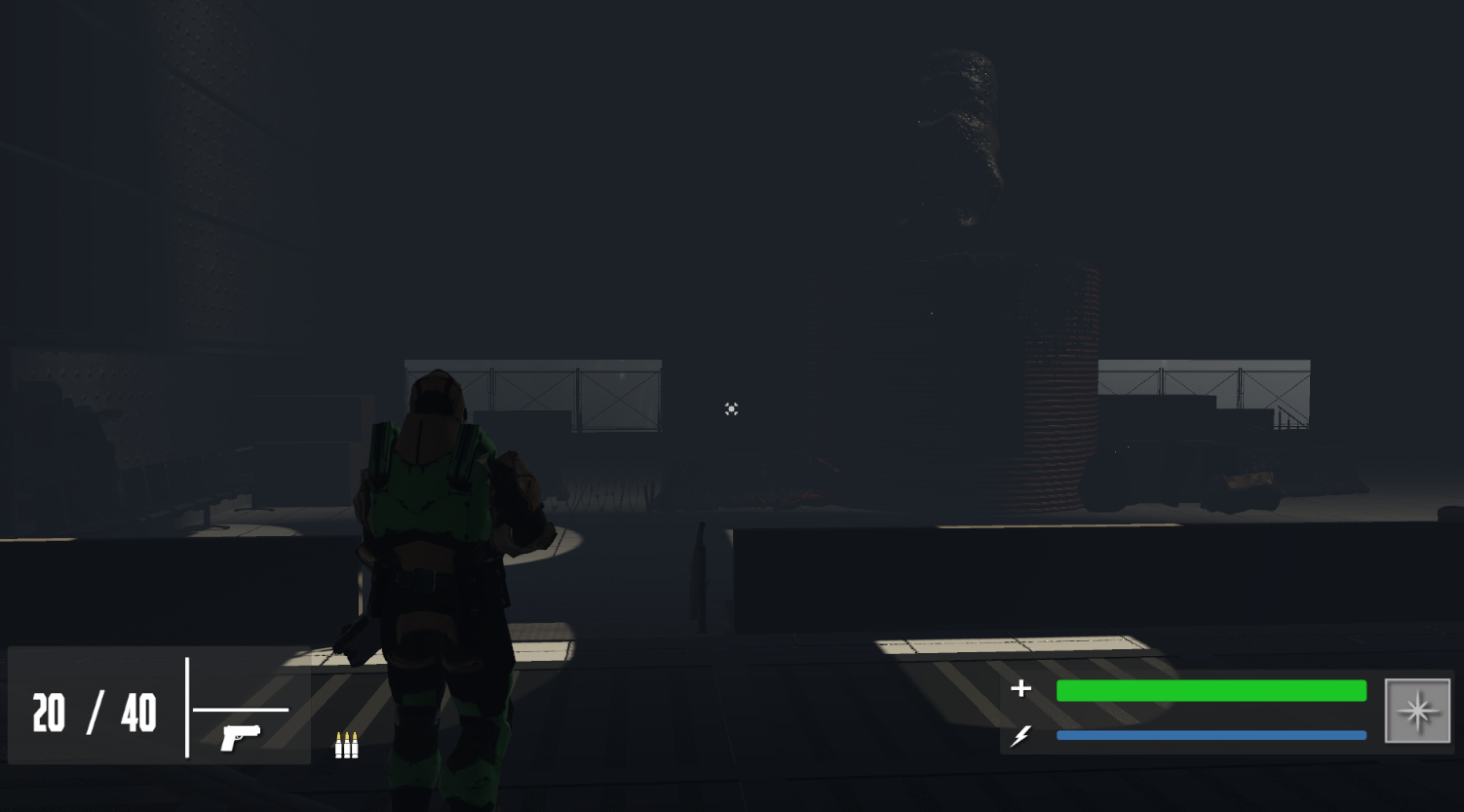
To create the horror feeling of the game, I included a lof of fog in the scene. The decision to always set the game at night. This was done to evoke some sort of feeling of unease and a fear of not knowing what is in front of them.
Game Design Pillars for Into The Fray
Sidearm Icon
The Level Layout
The Reception Level

An early prototype of the level design done using Blender
An updated version of the level design done in Unity

Single Shot Mode Icon

Assault Rifle Icon
Stamina Icon

Health Icon

The 4 player character colour options
An early version of the HUD design of Into the Fray

An early version of the main menu screen

Players can enter their display name. This name will be visible to other players.

Full Auto Mode Icon
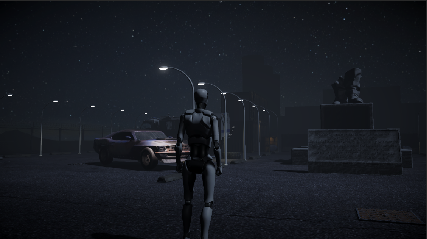
The Parking Lot Level
Parking Lot Level Design:
There was a strong emphasis on the story telling element of our game. Because this was a multiplayer game and we unfortunately lacked the skill to produce an engaging cutscene, we decided to tell the story through our level design and gameplay.
In the parking lot level, there is a broken statue of the founder of the company that lies in the center. There are broken down cars, empty shipping containers, steel barrels, barbed wires, and many more. These elements show that this parking lot was once a safe haven for survivers.
The design process for this level was very irterative. It started out with a rough drawing on a piece of paper, and after discussing it with my team members, I kept on iterating on the design and ultimately ended up with what is there now.
Into the Fray Early Prototype
Designing the User Interface (UI):
Heads-Up-Display (HUD):
One of the design inspiration for this project was game World War Z. The UI in World War Z is simplistic in nature, but gets just the right information across to the player in an easy to understand way.
While creating the HUD for Into the Fray, I wanted to keep it simple as and easy to read. The goal was that players should be able to have a quick glance at the UI and understand what it communicated with them.
Earlier prototypes of the game’s HUD included the health of other players, context specific information displayed on the left-hand side of the screen that was written inside of a black coloured shape, different consumables and throwables displayed next to the amount count.
We felt that this layout would cluter the screen a bit too much and distract the player from looking what’s in front of them.
So I positioned the context specific information like the Current Objectives on the top right of the screen, as that would naturally move the player’s eyes to look at what is in front of them and not on the side.
I also got rid of the player health bars as I felt that this would incentivize the players to use the voice chat functionality and communicate more.
The power ups information was also simplified down further for easier readability at a quick glance.
Menus and Loading Screens:
Main Menu:
In the very first page that the player will see, we wanted to give them an idea about what they’re heading into. The main menu page has to give the players an idea about what the game is all about, and set the mood for the rest of their experience with the game.
When designing the main menu screen, we first prototyped it with some basic shapes and Unity’s default 3rd person character. We knew we wanted the character next to a window inside an abandoned location.
We kept on iterating and adding new elements to the scene to make it look like it would belong somewhere in the universe of the actual game itself. The dead zombie, the blood behind the name, the damaged wall, and the destroyed room are all design choices that contribute to creating the right atmosphere for the players.
Like every other main menu screen, this one had to be functional as well, giving the player’s just enough information so that they know what the game is about. We only decided to add three buttons: Play, Settings, and Exit.
Join/Create Lobby and Character Selection Page:
Once the player presses “Play”, they are greated by the “Enter display name” screen, in which they can input a name that will be visible to other players.
After that, they can connect to our server and either create a lobby or join a lobby with other players. Here, they can select which character they would like to take. It also shows them what character their teammates are picking.
Iconography used in the HUD:
Ammo Types and Weapon Selection:
The game has 3 different ammo types: Burst fire, full auto, and single shot.
I designed the icons for these ammo types keeping in mind the easy readability against different coloured backgrounds. They also needed to belong to the same family of icons used, but be different enough that the player can read them at a short glance.
The icons also depict information about the functions of the ammo type. Single shot fires only one bullet at a time, full auto fires bullets continueously till the fire button is pressed, and burst fire mode fires a small number of bullets in a single press of the fire button.

Burst Fire Mode Icon

Ability Icon
The game has 2 different guns: A sidearm named The WolfFang and an assault rifle named The Hammerhead. Each gun is denoted by their own unique and distinct icon.
Each gun can also have different firing modes, and the player can switch between weapons to use different firing modes.
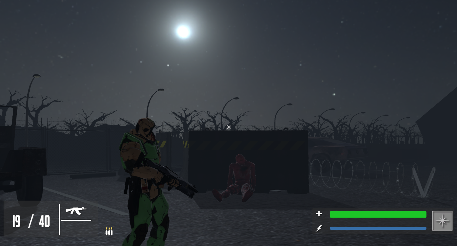
Player Statistics:
There are 3 player stats that are displayed as part of the HUD in game. They are: player Health, Stamina, and the Ability Recharge.
The player’s health is denoted using a bar with a plus icon next to it, the stamina bar is denoted by the lighting bolt icon and the ability is shown using a star icon. I specifically chose these icons as these are quite self explanatory.
All three of them also use different colours to help readability. These stats have been grouped together so it makes it easy for the user to read them at a glance.
In earlier versions of the HUD design, I had used a simple bar for all three of these stats. But I quickly realised that looking at three bars could be a little confusing, especially if the colours are similar to the background. They would also take up more space and create a clutter on the bottom of the screen. The icon used for the ability also did not clearly indicate what it meant.
In the newer version, each icon is made big enough so it is clearly visible and uses a small drop shadow to separate it from the background.
Character Design:
Player Character:
The player character model was taken from Mixamo, the Vanguard operative, and is available in 4 different colours: blue, green, purple, and red.
Each player gets a different colour to make it easier to identify them during gameplay.
The character design is part of the narrative of the game. The model used is of a futuristic soldier, which is reminisent of the futuristic theme of the narrative of the game.
The choice of a futuristic soldier model not only provides thematic consistency but also immerses players in the game's virtual universe. This intentional blend of aesthetics and functionality enhances both gameplay clarity and the storytelling experience, creating a cohesive and engaging environment for players.
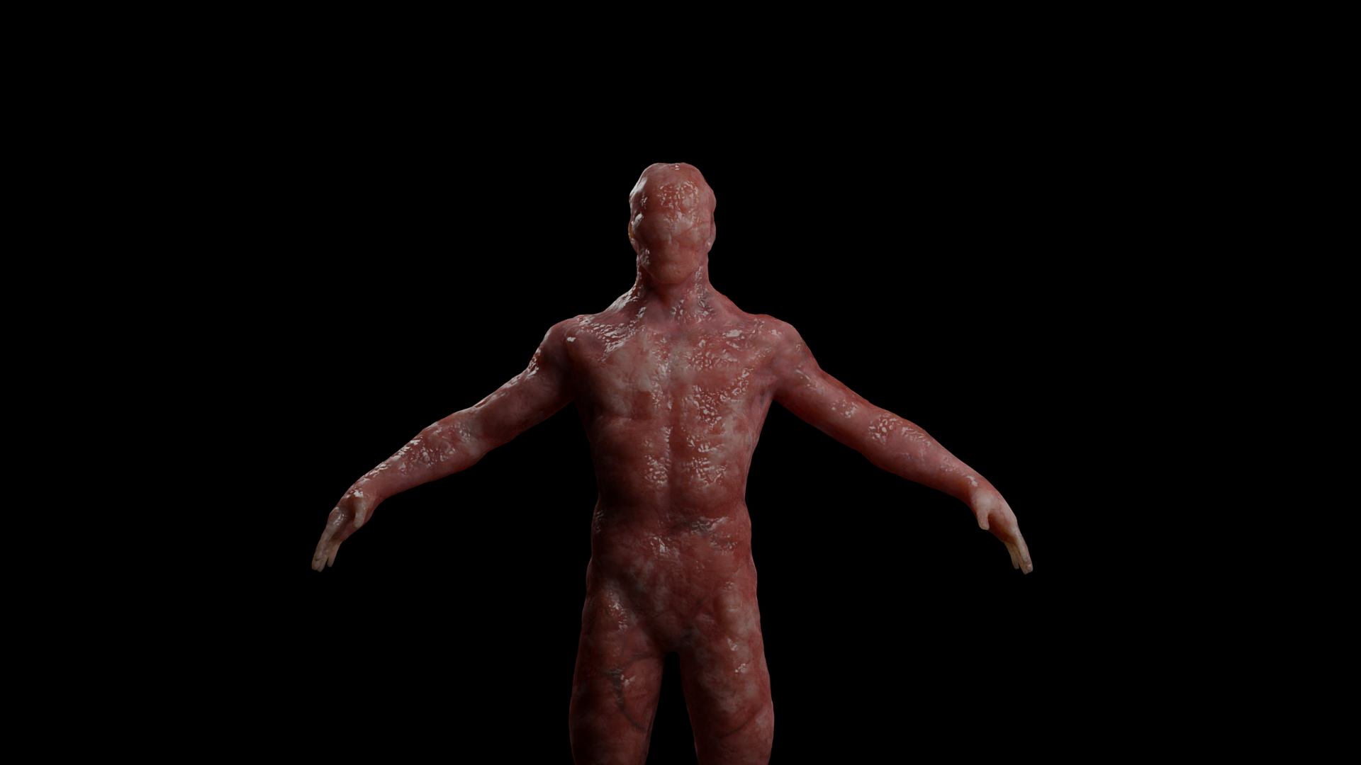
Enemy Character:
The basic enemies used in this game are human like creatures made of just flesh and bones. The design inspiration for these enemies comes from the clickers in the game “The Last Of Us”.
The creatures are a result of the asteroid that hit the nation of Valenthia, where the game is set, and the resulting space mineral caused a lot of the resident’s bodies to mutate.